
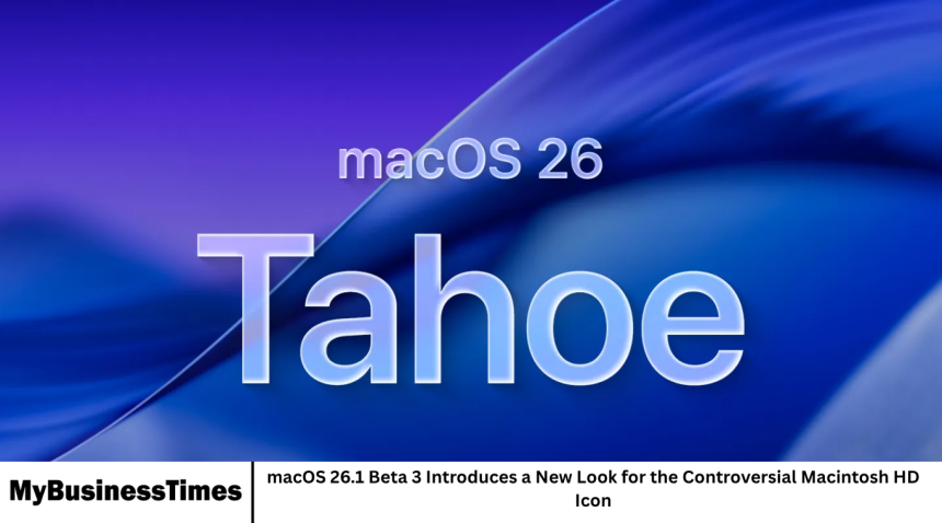
Apple continues to refine the user experience in macOS, and the latest beta, macOS 26.1 Beta 3, brings an unexpected visual change. The Macintosh HD icon, which has been a source of debate among Mac users for years, has received a fresh redesign. This update highlights Apple’s ongoing efforts to modernize its interface while balancing user familiarity with aesthetic improvements.
- The New Macintosh HD Icon
- Why the Icon Change Matters
- Community Reactions
- Beta Testing Insights
- Impact on Everyday Mac Use
- Frequently Asked Questions
- What exactly changed in the new Macintosh HD icon?
- Will this update affect the functionality of my Mac?
- Can I revert to the old Macintosh HD icon?
- Why do some users dislike the new icon?
- Does the new icon work well with dark mode?
- Will this change appear in the final macOS 26.1 release?
- How does the icon compare to other macOS icons?
- Is this the first time Apple has redesigned the Macintosh HD icon?
- Does this change reflect a larger design update in macOS 26.1?
- Can third-party apps display the new Macintosh HD icon?
- Conclusion
The New Macintosh HD Icon
The most noticeable change in macOS 26.1 Beta 3 is the updated appearance of the Macintosh HD icon. The new design is more streamlined and polished, reflecting Apple’s signature minimalist style. Rounded edges, subtle gradients, and a more modern color palette give the icon a contemporary look. While some users appreciate the cleaner appearance, others miss the distinctive charm of the previous design.
Why the Icon Change Matters
The Macintosh HD icon is more than just a visual element; it represents the primary storage drive for Mac systems. Users interact with it regularly when navigating Finder, backing up data, or performing system tasks. Because of its constant presence, even small changes can significantly affect the overall user experience. Apple’s decision to update it in Beta 3 indicates a push toward consistency across macOS visuals.
Community Reactions
Reactions to the redesign have been mixed. Some Mac enthusiasts praise the modern, polished look, claiming it aligns better with the overall macOS interface. Others feel the icon lacks personality and misses the bold, instantly recognizable feel of the older design. Online forums and social media have seen debates among users weighing the pros and cons of the new icon.
Beta Testing Insights
Beta testers have noted that the new icon integrates well with Finder’s new features and dark mode. The subtler gradients make it less jarring in different interface settings, which may improve visual coherence. Developers and power users are also paying attention to whether this change affects how icons are displayed in third-party applications.
Impact on Everyday Mac Use
For the average user, the change is mostly cosmetic. It does not affect functionality, performance, or access to files. However, for design-conscious users, the icon represents Apple’s attention to detail and commitment to interface refinement. Even small visual tweaks like this can influence user satisfaction and perception of the macOS ecosystem.
Frequently Asked Questions
What exactly changed in the new Macintosh HD icon?
The icon now has rounded edges, subtle gradients, and a more modern color palette, giving it a cleaner and more polished look.
Will this update affect the functionality of my Mac?
No, the change is purely visual and does not impact system performance or file access.
Can I revert to the old Macintosh HD icon?
Yes, advanced users can manually change icons through Finder, though this is not officially supported by Apple.
Why do some users dislike the new icon?
Some feel it lacks the boldness and personality of the previous design and is too subtle compared to older versions.
Does the new icon work well with dark mode?
Yes, beta testers have noted that the subtler gradients make it blend well with both light and dark mode.
Will this change appear in the final macOS 26.1 release?
It is likely, but Apple may further tweak the design based on beta feedback before the official release.
How does the icon compare to other macOS icons?
It aligns with Apple’s minimalist design trend, using clean lines and subtle shading consistent with other system icons.
Is this the first time Apple has redesigned the Macintosh HD icon?
No, the icon has undergone several updates over the years, but each redesign has sparked discussion among users.
Does this change reflect a larger design update in macOS 26.1?
Yes, Apple is refining system icons and interface elements to create a more cohesive and modern aesthetic.
Can third-party apps display the new Macintosh HD icon?
Third-party apps that rely on system icons should automatically adopt the new design, though developers may need to update for optimal compatibility.
Conclusion
The macOS 26.1 Beta 3 update demonstrates Apple’s ongoing attention to design and user experience. While the new Macintosh HD icon may spark debate, it reflects a move toward a modern, polished interface. Whether users embrace or critique the change, it highlights how even small visual updates can have a meaningful impact on the look and feel of macOS. The redesign is a reminder that in Apple’s ecosystem, attention to detail extends even to the smallest elements.